Walk into any room and your brain makes a judgment in 90 seconds or less - and up to 90% of that assessment is based on color alone (Institute for Color Research). Color doesn't just decorate a room; it shapes how you feel in it, how large it appears, and whether you want to stay or leave.
Yet choosing paint colors remains one of the most anxiety-inducing decisions in home design. There are over 3,500 paint colors available from major brands, and a single wrong choice can make a $30,000 kitchen renovation feel cold and uninviting. According to a 2025 survey by the National Association of Home Builders, 85% of homebuyers say color is the primary reason they're drawn to - or repelled by - a home.
This guide is designed to be the only color resource you'll need. We'll walk through the psychology of every major color, give you specific room-by-room palette recommendations with exact hex codes, cover the latest 2026 trends, explain color scheme theory in plain English, and show you how to test colors with AI visualization before committing to a single gallon of paint.
Color Psychology 101
Color psychology is the study of how hues influence human behavior and emotion. While individual responses vary by culture and personal experience, decades of research have established strong general patterns. Understanding these patterns is the foundation of intentional color design - choosing colors not just because they look good, but because they feel right for the function of each room.
Blue - Calm, Trust & Serenity
Blue is universally associated with calm, trust, and mental clarity. It lowers heart rate and blood pressure, making it the most recommended color for spaces where relaxation matters. A 2024 Travelodge study found that people sleeping in blue bedrooms averaged 7 hours 52 minutes of sleep - the most of any color.
Bedrooms, bathrooms, home offices, meditation spaces
42% of people name blue as their favorite color - making it the most popular bedroom choice globally
Green - Balance, Growth & Focus
Green sits at the center of the color spectrum, and the human eye can distinguish more shades of green than any other color. It represents nature, balance, and renewal. Research from the University of Exeter found that green environments boost creative performance by 15% compared to neutral settings. Green reduces eye strain and promotes concentration - making it ideal for work environments.
Home offices, living rooms, kitchens, reading nooks
Sage green has been the fastest-growing interior color search term for 3 consecutive years
Yellow - Energy, Optimism & Warmth
Yellow is the most psychologically stimulating color. It triggers the release of serotonin - the "feel-good" neurotransmitter - and is associated with creativity, energy, and optimism. However, it's also the most fatiguing color to the eye in large doses. The key with yellow is restraint: muted buttery tones for walls, brighter saturations for accents only.
Kitchens, breakfast nooks, hallways, craft rooms
Kitchens with warm yellow tones report 20% higher homeowner satisfaction ratings
Red - Appetite, Passion & Energy
Red is the most physically stimulating color - it increases heart rate, blood pressure, and even appetite. This is why every major fast food brand uses red in their branding. In interior design, pure red is intense; the modern approach favors muted reds like terracotta, clay, and dusty rose for sophistication without overstimulation. In dining rooms, warm red tones encourage lingering conversation and appetite.
Dining rooms, entryways, accent walls, wine cellars
Studies show red environments increase food consumption by up to 25%
White - Spaciousness, Purity & Versatility
White remains the most used interior color worldwide - and for good reason. It reflects maximum light, makes spaces feel larger, and provides a blank canvas for furniture and art. But not all whites are equal. The biggest mistake homeowners make is choosing a stark, blue-toned white (which feels clinical) instead of a warm white with yellow or cream undertones (which feels inviting). The right white can add 8 - 10% to a room's perceived size.
Any room - especially small spaces, minimalist interiors, galleries
White accounts for 35% of all interior paint sales globally
Gray - Sophistication, Neutrality & Elegance
Gray dominated the 2010s as "greige" (gray + beige) swept through every home magazine. While its peak popularity has cooled, warm grays remain a cornerstone of sophisticated interiors. The trick is avoiding cool, blue-toned grays in rooms with warm lighting - the clash creates a dingy, unwelcoming feel. In 2026, the trend has shifted toward warm grays with taupe or mushroom undertones that play beautifully with natural materials.
Any room - living rooms, bedrooms, kitchens, bathrooms
Warm gray is the #1 recommended "safe" neutral by professional designers
Black - Drama, Luxury & Depth
Black in interiors was once considered taboo - too dark, too moody, too risky. In 2026, it's a go-to for designers who want to add instant gravitas. A single black accent wall can make a room feel 40% more expensive (Zillow 2024 paint color analysis). The key is balance: pair black with warm metals (brass, gold), rich textures (velvet, leather), and ample lighting. Black works best as an accent - feature walls, cabinetry, trim, and fixtures rather than entire rooms.
Accent walls, kitchens (cabinetry), bathrooms, home offices
Black front doors increase home resale value by an average of $6,271 (Zillow)
Warm Neutrals - Coziness, Comfort & Timelessness
Warm neutrals - beiges, tans, caramels, and mushroom tones - are the unsung heroes of interior design. They create a sense of warmth and comfort without demanding attention, making them the ideal backbone for layered, textural rooms. The 2020s "sterile white and gray" aesthetic has given way to what designers call "warm minimalism" - spaces that feel curated, natural, and lived-in. Warm neutrals pair effortlessly with wood, linen, stone, and leather.
Living rooms, bedrooms, hallways, open-plan spaces
Warm neutral interiors are rated "most inviting" by 68% of respondents in design surveys
Color Temperature Science
Understanding color temperature is arguably more important than understanding individual colors. Every color has a warm or cool lean, and this single factor determines whether your room feels inviting or institutional, cozy or sterile.
Warm Colors vs. Cool Colors
Warm Colors
Reds, oranges, yellows, warm whites, and warm grays. These colors advance - they make walls feel closer and rooms feel more intimate. They evoke sunlight, fire, and comfort. Warm colors are ideal for large rooms that feel cavernous, north-facing rooms with limited natural light, and spaces designed for socializing.
Cool Colors
Blues, greens, purples, cool whites, and cool grays. These colors recede - they make walls feel farther away and rooms feel more spacious. They evoke water, sky, and open air. Cool colors excel in small rooms that need to feel larger, south-facing rooms with abundant sunlight, and spaces designed for rest and focus.
How Lighting Changes Everything
The same paint color will look dramatically different under various lighting conditions. This is the #1 reason paint samples look great in the store and wrong on your wall. Here's the science:
North-facing rooms
Receive cool, indirect light. Colors appear slightly more blue and muted. Warm colors work best to compensate.
Pro tip: Avoid cool grays - they'll look blue-gray and chilly.
South-facing rooms
Flooded with warm, direct light. Colors appear warmer and more saturated than the swatch. Cool colors balance nicely.
Pro tip: Warm whites may look yellow. Test with a slightly cooler white.
East-facing rooms
Warm morning light, cooler afternoon. Colors shift throughout the day. Test at both times.
Pro tip: Choose mid-tone neutrals that transition well across lighting changes.
West-facing rooms
Cool morning, intense warm afternoon/evening light. Colors glow golden in the evening.
Pro tip: Avoid strong oranges and reds - afternoon light will amplify them.
Understanding Undertones
Every paint color has an undertone - a subtle secondary hue that becomes visible once the paint is on the wall. A gray might have blue, green, or purple undertones. A white might lean pink, yellow, or blue. Undertones are the reason two "gray" paints can look completely different in the same room.
The rule: Match your color's undertone to the room's fixed elements. If your floors are warm oak, your countertops are warm marble, and your light is warm - choose a paint color with warm undertones. Mixing warm fixed elements with cool paint undertones creates a visible clash that makes the room feel "off" without most people being able to articulate why.
Room-by-Room Color Recommendations
Every room has a different purpose, and its color palette should support that purpose. Below are specific recommendations with 3-color palettes (base, secondary, accent) and exact hex codes you can reference when shopping for paint or visualizing with AI.
Living Room
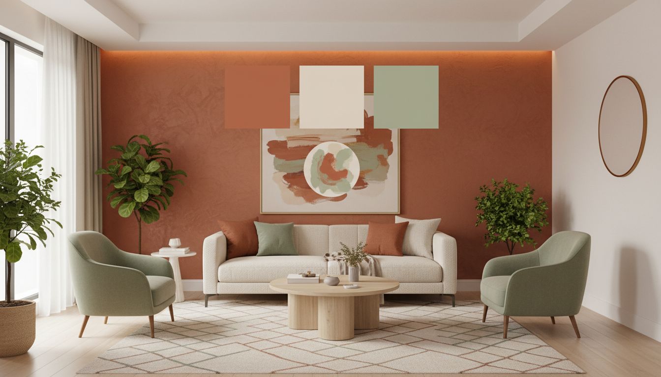
The living room is your home's social hub - a space for conversation, relaxation, and entertaining. It needs to feel warm and inviting without being overstimulating. Warm neutrals, soft greens, and muted blues are the safest choices with the highest satisfaction rates.
Warm whites, sage green, soft taupe, muted terracotta, navy (accent)
Neon or electric colors, stark white, bright orange, dark purple on all walls
Bedroom
Your bedroom is your retreat. Sleep research consistently shows that cool, muted colors promote the best sleep quality. Blue bedrooms average the most sleep time, followed by green and silver/gray. Avoid stimulating colors like red and bright orange, which raise alertness.
Soft blue, lavender, pale green, warm white, dusty rose, cool gray
Bright red, electric yellow, saturated orange, dark brown on all walls
Kitchen
Kitchens need colors that energize and inspire without overwhelming - you'll spend significant time in this room. White and off-white dominate kitchen design for good reason (cleanliness, brightness), but 2026 is the year of bold kitchen cabinetry. Deep greens, warm navy, and matte black cabinets with warm countertops are leading the trend.
White, off-white, soft yellow, sage green, navy (cabinets), warm gray
Dark colors on all surfaces, neon accents, cool gray with warm wood
Bathroom
Bathrooms should feel clean, spa-like, and refreshing. Light colors maximize the typically limited space, while cool tones reinforce the association with water and cleanliness. Small bathrooms benefit enormously from light palettes - a soft blue or green can make a 5x8 bathroom feel 30% more spacious than a dark gray.
Soft blue, seafoam green, warm white, light gray, pale blush
Saturated dark colors in small bathrooms, busy wallpaper patterns, bright yellow
Home Office
Your home office needs colors that promote concentration without fatigue. Green is the scientifically optimal choice - it reduces eye strain, boosts creativity, and doesn't overstimulate. Blue is the second-best option for analytical work. Avoid pure white (causes eye fatigue from screen glare) and warm, drowsy colors like deep red or dark purple.
Sage green, soft blue, warm gray, muted teal, off-white
Bright red (too stimulating), pure white (screen glare), dark rooms without balance
2026 Color Trends
Color trends in interior design evolve yearly, driven by cultural shifts, global events, and the collective desire for specific moods in our homes. Here's what's defining 2026:
Mocha Mousse (PANTONE 17-1230)
Pantone's 2026 selection is a rich, warm brown with rosy undertones - evoking the indulgent comfort of chocolate and coffee. It reflects the global shift toward warmth, nature, and sensory pleasure in interiors. Mocha Mousse works beautifully as a wall color in living rooms and bedrooms, as an upholstery tone, or as a warm accent against lighter neutrals.
Earth Tones & Organic Palettes
The dominant macro-trend of 2026 is a deep embrace of earth-inspired colors: terracotta, clay, sand, olive, mushroom, and warm browns. After years of cool minimalism, homeowners are gravitating toward colors found in nature.
Warm Minimalism
Cool-gray-and-white minimalism is officially over. The new minimalism is warm - cream walls instead of stark white, honey oak instead of bleached wood, brass hardware instead of chrome.
Bold Monochromatic Rooms
The "everything matches" trend is surging in 2026 - entire rooms designed in a single color family at varying saturations.
Nature-Inspired Greens & Blues
Sage green, olive, eucalyptus, forest green, dusty teal, and ocean blue continue their multi-year surge. Driven by biophilic design.
Color Schemes Explained
A color scheme is a structured set of colors based on their relationships on the color wheel. Using a proven scheme eliminates guesswork and ensures your palette is harmonious. Here are the four most useful schemes for interior design:
Complementary (High Contrast)
Two colors directly opposite each other on the color wheel - like blue and orange. Example: navy walls with terracotta throw pillows.
Analogous (Harmonious)
Three colors sitting next to each other on the color wheel. Example: sage green walls, teal cushions, soft blue curtains.
Triadic (Balanced Vibrancy)
Three colors evenly spaced around the color wheel. Example: warm cream walls, sage green upholstery, dusty purple cushions.
Split-Complementary (Contrast with Nuance)
A base color plus the two colors adjacent to its complement. Example: soft blue walls, warm terracotta accents, golden brass hardware.
Test Colors Before Painting
The single most important rule: never commit based on a paint chip alone. Tools like Deqor's AI Studio let you upload a photo and see any color applied photorealistically. You can test dozens of colors in minutes rather than days.
See your room in any color - in seconds
Upload a photo, choose a color, and let AI show you the result.
Open Deqor Studio10 Common Color Mistakes (and How to Avoid Them)
Even experienced homeowners make these mistakes. Knowing them in advance saves you time, money, and frustration.
Going Too Bold on All Walls
Use the 60-30-10 rule: neutral base, medium-intensity secondary, bold accent.
Ignoring Undertones
Match undertones to your room's fixed elements.
Forgetting the Ceiling
Paint ceilings a slightly tinted version of your wall color.
Not Considering Adjacent Rooms
Choose a cohesive palette that transitions smoothly.
Choosing Colors Under Store Lighting
Always bring swatches home and view under your actual lighting.
Matching Paint to Furniture Exactly
Choose colors in the same family but at different saturations.
Using Too Many Colors in One Room
Stick to base, secondary, and 1–2 accents.
Neglecting Natural Light Direction
Factor in your room's orientation when choosing colors.
Following Trends Blindly
Choose colors you genuinely love - timeless beats trendiness.
Not Testing Paint Before Full Commitment
A $5 sample or free AI visualization can save you from a $500 mistake.
Frequently Asked Questions
What is the most popular interior paint color in 2026?
Warm whites and off-whites remain the most popular. The fastest-growing are warm neutrals (Mocha Mousse, sand, caramel) and nature-inspired greens (sage, olive, eucalyptus).
What color makes a small room look bigger?
Light, cool colors: soft whites, pale blues, light grays, muted greens. The right light color can make a room feel 8–10% larger.
What is the 60-30-10 color rule?
60% dominant (walls), 30% secondary (upholstery, curtains), 10% accent (pillows, art).
How do I test paint colors without painting my walls?
Peel-and-stick swatches (Samplize), paint on white poster board, or use AI tools like Deqor to see any color on your room in minutes.
What colors increase home resale value?
Light blue bathrooms (+$2,786), soft gray-blue kitchens (+$1,809), navy front doors (+$6,271), warm greige living rooms (+$1,526).
Written by Deqor Editorial
The Deqor editorial team covers AI design technology, interior design trends, and practical color guides for homeowners and professionals. Every recommendation is backed by research and real-world testing.
Last updated: March 7, 2026 · Reviewed for accuracy by the Deqor product team